


Personal Science Week - 250410 DHRPS
The latest LLMs make it super easy to evaluate yourself against a new fitness metric
You see a new research paper that makes an intriguing claim, but you’re curious about how you might fit into the data.
This week we’ll show how to take an interesting research paper and compare it with your own data. The best part: we’ll use an LLM chatbot to make the analysis in minutes.
The latest LLMs continue to improve at a rapid pace, making many of my previous caveats obsolete. Tools like ChatGPT or (my current favorite) Claude are indispensable now for any personal scientist. Here’s a simple example.
A new study published in the Journal of the American Heart Association proposes a new metric, Daily Heart Rate Per Step (DHRPS), which they claim is highly associated with heart health. (Read a layman’s summary here). The researchers, from Northwestern University, used wearable data from 7000 participants in the NIH All-of-Us research program, to calculate the ratio between daily heart rate and daily step counts. Yes, it’s a crude metric, but they have enough data that they were able to find an interesting relationship with overall health.
But personal scientists don’t care about averages; I’m not an average, I’m me. The study means nothing unless I know how I fit in the data.
Back in the old days, before LLMs, I might have spent an afternoon or a weekend downloading and processing my data to see how I fit with this study. But now, I can generate the results in minutes. Here’s how:
First, I keep my Apple Watch data synchronized with Auto Health Export (which we first discussed back in PSWeek221027). This makes it easy to generate two CSV files: one with my daily average heart rate, and the other with my daily average steps.
Second, I have already created a project in Claude called “Personal Health”. Claude lets me keep several megabytes of files as background (called “knowledge”) for my project. I’ve already uploaded all my blood test results plus various other medical charts and information collected over the years.
Then I typed into Claude the following prompt:
using my step count and my heart rate, read this paper https://www.ahajournals.org/doi/epdf/10.1161/JAHA.124.036801 and tell me how I compare to the others in the study.
That’s it!
Claude then generated a detailed summary of how my data matches with the others in the study and the consequences for the amount and types of exercise I should consider:
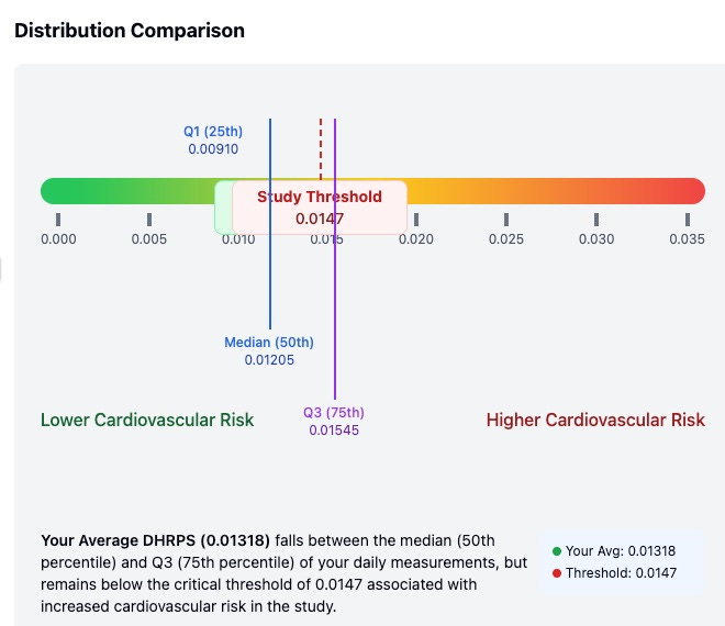
Your DHRPS metrics tell an interesting story about your cardiovascular efficiency. The visualization shows your average DHRPS value (0.01318) falls below the critical threshold of 0.0147 identified in the study. This threshold is significant because values above it may suggest that "the heart is working harder than it should".
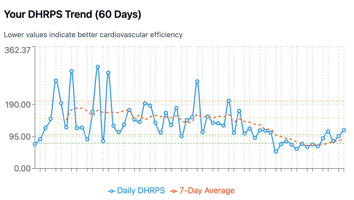
What's particularly interesting is the improvement trend visible in your data. While you had some days with elevated DHRPS values in January (28.3% of total days were above threshold), your February data shows a much more consistent pattern of favorable values. This suggests your cardiovascular system may be becoming more efficient relative to your physical activity level.
When compared to the study population quartiles, your average value falls between the median and 75th percentile of your own daily measurements, indicating moderate day-to-day variability. However, your overall average remains in the favorable range associated with lower cardiovascular risk in the study.
This data provides encouraging evidence that your current exercise regimen is supporting good cardiovascular efficiency, which aligns with your excellent exercise capacity demonstrated on your stress test (12.8 METs). It's an important counterpoint to consider alongside your lipid profile, suggesting that despite the elevated LDL cholesterol, your heart is functioning efficiently during physical activity.
Finally, Claude summarized the situation with some easy-to-read plots:
Even if you’re an experienced programmer, doing all this analysis by hand would take hours, perhaps days, especially if you want well-made chart summaries. By making this analysis so easy, the new LLMs make even casual personal scientists far more productive.
This also brings us closer to the day when all research results are stored in dynamic documents that automatically update when you adjust the data. Rather than passively read a scientific article, or its summary in the popular press, imagine if you could enter your own self-collected data and have it immediately tell you exactly how you compare to the rest of the population.
Personal Science Weekly Readings
Speaking of peer-reviewed academic research and its contrast with personal science, the venture fund 8VC has a proposal for a healthcare agenda for the new administration. Published in January, before the breakneck torrent of changes by the current administration, it offers some good context if you’re trying to keep track. For example, did you know that the federal government pays the American Medical Association $100M / year to develop and maintain all those billing codes that doctors use for reimbursement? That’s just one of many bureaucratic rules that slow everything down.
Another big one is the requirements for IRBs, the Institutional Review Boards that seem like a good idea on paper but in practice cause far more problems than they solve. Heterodox Academy published a detailed explanation in Inquisitive Magazine on why IRBs are bad.
Meanwhile, although you need an IRB to get published in any peer-reviewed publication, a lengthy piece in The Conversation explains how that obviously isn’t helping stop the flood of Fake scientific papers contaminating legitimate scholarly output.
Finally, here’s a database of “Open Challenges”, a searchable catalog of challenges (any type of citizen science experiment) from across the web that address areas of significant unmet medical need. Kept by Sage Bionetworks.
For example, here’s a challenge to predict real-world discrimination of smells. “Using publicly available data from 3 different studies (Bushdid et al 2014, Snitz et al 2013, Ravia et al 2020) for more than 700 unique mixtures and almost 600 measurements of mixture pairs discriminability, participants will be tasked to predict the discriminability of 46 unpublished mixture pairs.”
And Tracy Swartz wrote a nice summary in the New York Post of some of the fun stuff at last week’s Biohackers World expo in Los Angeles (as we announced in PSWeek250320)
Events on the Calendar
If you’re in Seattle, please join me for a discussion on “Healthy Humans of Seattle: Microbiome”. Sunday afternoon April 27th: (RSVP here)
If you’re in the Bay Area May 5-8, please join us at the Global Synthetic Biology Conference. Our friend Jocelynn Pearl is leading a session on DeSci and the future of biology and biohacking.

About Personal Science
Be open-minded but skeptical: that’s the guiding principle of personal science, where we try to apply the truth-seeking power of science to everyday situations.
We publish thoughts about personal science every week. If you have other ideas you’d like to discuss, let us know.
Not terribly surprising that the step count + heart rate is a better population-level indicator of health than either metric alone...
Thank you for the reminder of Auto Health Export. I either missed this when you first mentioned it or forgot about it. (I just checked Personal Science Wiki, and it's there, so I may be the only one who hadn't noticed.) I've been using Claude prompts like this, too. This kind of thing is a huge help.