Personal Science Week 230413 Dataviz
Easy ways to visualize and present your data, plus some great science visuals
This is a short summary, published each Thursday, of ideas and tips we think are useful to anyone who wants to be a Personal Scientist, using the techniques of science for personal, rather than professional reasons.
This week we’ll explore a few simple ways to visualize data, plus additional links of interest.
The written word is a great way to organize and communicate detailed thoughts, but nothing beats a well-done image or diagram to effectively organize complex numbers. Professional scientists invest years honing their number-crunching and plotting skills in Excel, SPSS, Matlab, Mathematica, SAS, and many others. But what are your options as a Personal Scientist?
One of the easiest is DataWrapper, from a Berlin-based team that sells production-quality graphics to major international newsrooms, universities, and corporations. They also operate a completely free, no signup-required, web app that lets anyone quickly generate charts from data you can easily copy/paste to their site.
Here’s an example showing my step count data, collected over the past month from my Apple Watch:
(I know, I know, don’t judge me: March 30th was an unusually busy meeting-filled day!)
To make this chart, I used the highly-recommend app, Health Auto Export (which we discussed in Personal Science Week - 27 Oct 2022) to export my step data from Apple Health. I then simply copy/pasted the resulting CSV data directly into the Datawrapper site. The data becomes instantly publishable, either as a link (like the one above) or as an embeddable version for easy insertion into any web page.
For even more sophisticated data visualization, use the free version of Tableau Public. This is a top-of-the-line software package used by professionals, often generating complicated financial reports that are too big for Excel. The limitations on the free version (10M records, 10GB data) are well within anything you’re likely to need for personal use, so it’s a great choice for fancy graphs that you can’t do in Excel.
If you’re comfortable with programming, you’ll know about many other excellent tools, like Plotly, Bokeh, Seaborn, and many others. One of my favorite, under-appreciated ones is the open source Visidata, a great command line data handling tool. We already discussed the easy-to-use analysis and graphics tools from Observable in Personal Science Week - 28 Jul 2022
Dataviz example: Scientific Evidence for Popular Supplements
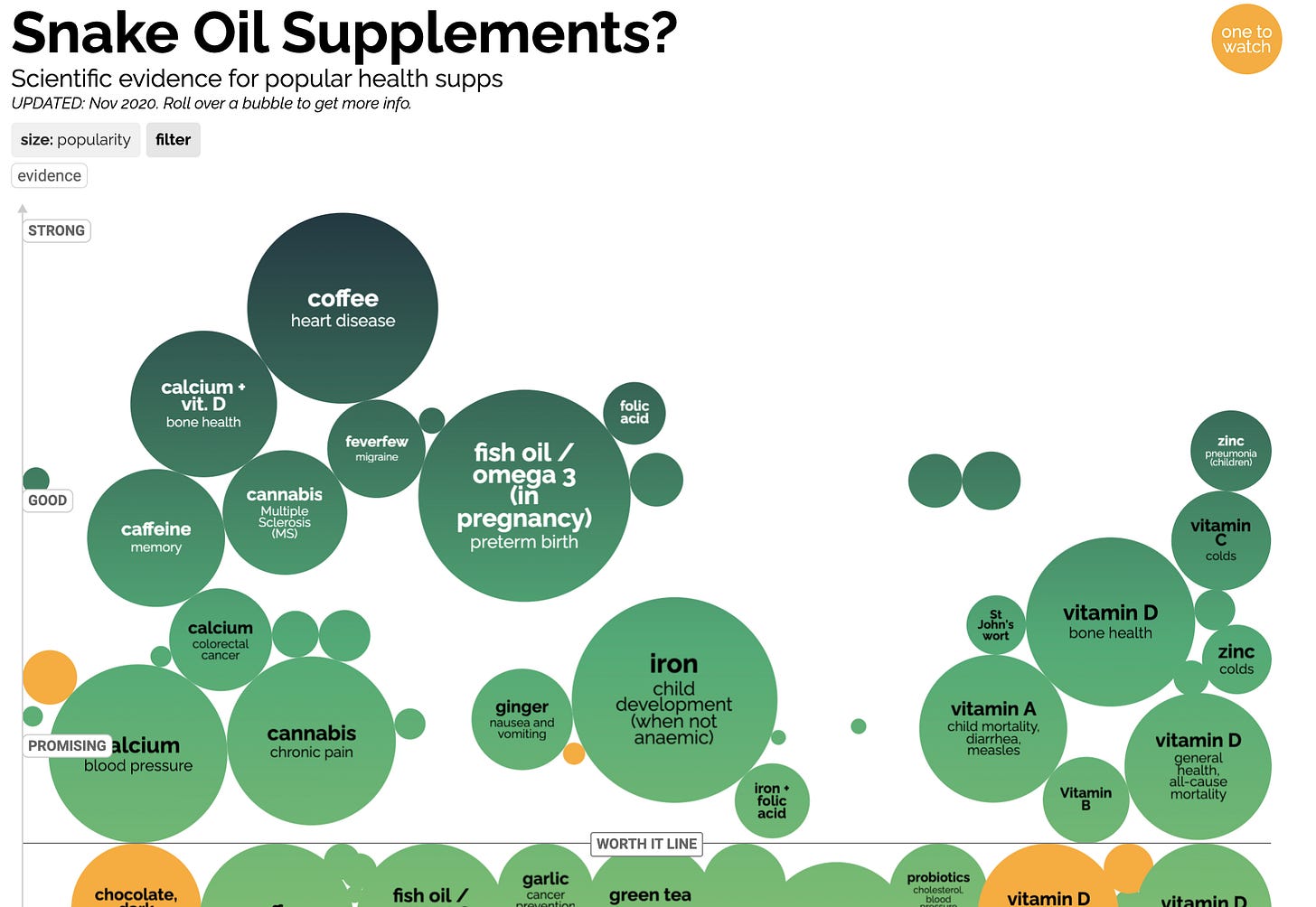
Among the best data visualizations we’ve seen is this summary at the wonderful site Information is Beautiful of the “scientific evidence for popular supplements”:
The visualizations are interactive, so it’s difficult to do justice in a static image, but here’s a flavor:

The interactivity makes this especially useful, because you can instantly click through to the details of the evidence for each supplement. Oh, and the raw data in all in a Google Sheet. Highly recommended.
More links this week
There is no shortage of incredible data visualizations, and you probably already know about sites like Reddit Data Is Beautiful, which regularly features great charts, along with pointers to how they are made. Here are a couple more that might be especially useful to Personal Scientists:

Connected Papers is a site that will show graphically how academic papers relate to one another. It’s a useful way to begin exploring a new subject
I like this image, from the 1997 book by R.J Blin-Stoyle, EUREKA!: Physics of Particles, Matter and the Universe. A good reminder of how little we humans really know about the Universe.
Other Personal Science Updates
Eric Topol writes a preliminary review of a continual blood pressure monitor bracelet from Swiss company Aktiia. He concludes it works better than traditional cuffs, especially at night. Also see the company’s April 2023 Nature piece outlining preliminary results.
Can your smartwatch send you to the hospital : overview of research about Apple Watch and its atrial fibrillation (AFib) features.
We favorably discussed Project Blueprint previously, but I’m becoming much more skeptical after reading how its author Bryan Johnson refused help from UCLA longevity expert Steve Horvath, according to Vice: ‘The Most Measured Man in Human History’. No serious scientist would refuse any feedback, much less help from a famous longevity researcher. Curiously the Blueprint Site is rarely updated, and Johnson’s related site, Rejuvenation Olympics, claims to allow discussion, but important questions go unanswered.
About Personal Science
Personal Scientists are skeptical about everything. It’s in our motto: Nullius in verba, the 1660 motto of the Royal Society: “take nobody’s word for it.” As much as possible, we try to present information that is testable from personal experience. If you have questions, ideas, or comments for future issues, please let us know:


Oh, and here’s another Datawrapper I like: My resting heart rate vs. activity: https://datawrapper.dwcdn.net/kGZXy/1/
Datawrapper looks great, I'll try it! When using Python/Jupyter, I prefer Altair, which is quite flexible, but without getting tedious: https://altair-viz.github.io/gallery/